IF WE'RE TO CHANGE OUR CLUB CREST.....
Recently, I've been reading a thread on the RAWK forums regarding our cub crest. They think that it looked a little too complicated and we should move on with time and design a new badge for future uses. Teams like Arsenal and Tottenham have recently changed their badges as well as Chelsea. Should we have a change too? I know it sounds like we're following the crowd, but some of the talented photoshoppers and artist on the forum made me think otherwise. They came up with some pretty decent designs and I picked a few from the large selection and let you have a look and decide. Here are the few selected designs...
The Original Liverpool Crest:
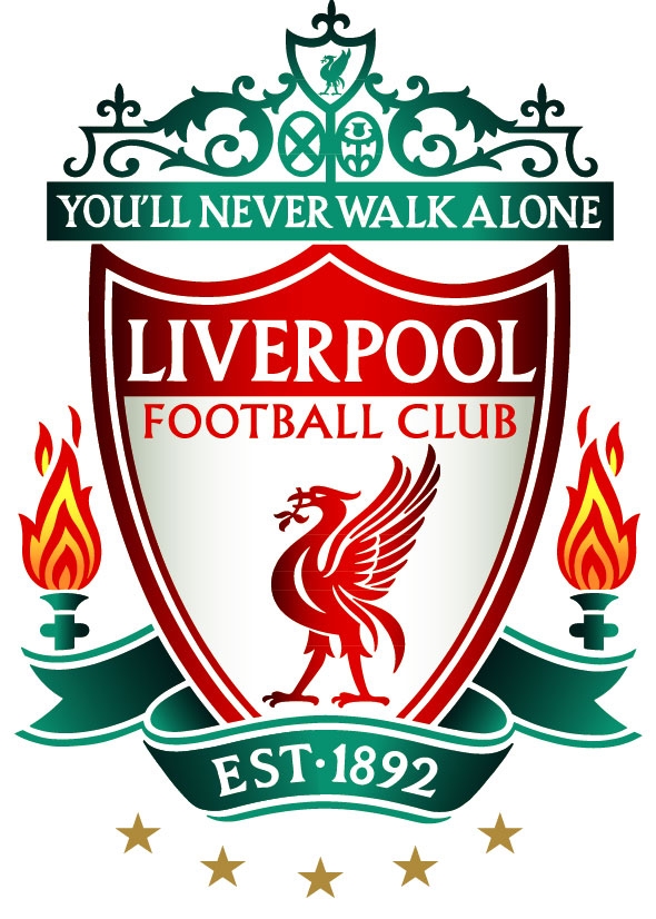
Okay, if all along you thought the one on my banner is the actual Liverpool crest, then sorry, this is the real deal. Actually it looked pretty damn good, just that it's a little too complicated in terms of design. And some complained, TOO MUCH GREEN!
Design 3:

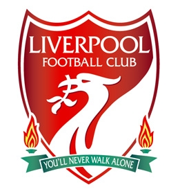
It's not a bad design AT ALL. But I found the crest a little.. too broad at the top and the badge looks weird with that shape. Don't really like the LFC as well, it looks.. weird on a badge.
Ya, anyway whatever it is, all credits due to the forum posters over at RAWK for the hardwork and hope you guys don't mind me using your stuff over here without permission! Just sharing and yes, brilliant work no matter what. I don't have the talent to do all this to be honest with ya. So what's your point of view then? Do drop a comment or two!
Okay, if all along you thought the one on my banner is the actual Liverpool crest, then sorry, this is the real deal. Actually it looked pretty damn good, just that it's a little too complicated in terms of design. And some complained, TOO MUCH GREEN!
Okay I'll place the next few designs according to my preferences.
Design 1:
Okay, this is my favourite, because the original designed seemed to remain intact and not much changes being done. Yet at the same time it looks much, much more refined and simple. Maybe a font change and it'll be near perfect.Design 2:
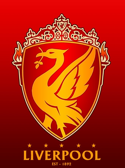
Now, this design looks real grand. It fits Liverpool well, as we're reknown for our glorious past. As Paul Tomkins descirbed, the Golden past and the Red future, this design seriously looks good. One thing about this design compared to the previous is that it has included the Shankly gates in the design. But I believe we should integrate the club name INTO the club crest itself.
Design 3:
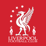
You want simple designs, you got it. This looks really orginal, as in the original badge even before our current one, with only the Liverbird. Now we've won the 5th European crown, we should be proud to display the 5 stars and the eternal flame should not be missing. Simple, sophiscated and I reckon it looks brilliant on jerseys!
Design 4:
It's not a bad design AT ALL. But I found the crest a little.. too broad at the top and the badge looks weird with that shape. Don't really like the LFC as well, it looks.. weird on a badge.
Ya, anyway whatever it is, all credits due to the forum posters over at RAWK for the hardwork and hope you guys don't mind me using your stuff over here without permission! Just sharing and yes, brilliant work no matter what. I don't have the talent to do all this to be honest with ya. So what's your point of view then? Do drop a comment or two!


3 comments:
the first design is the best
haha yea :)
I agree that the current badge is too detailed and too green. I personally love the red and gold/yellow colours, and think the liver bird should be a big presence on any new badge. I like the second design best.
Post a Comment